
View Slideshow
The clients, an investment banker and his wife, fell in love with the property—and, truthfully, who wouldn't? Rich with specimen trees, the hilly one-and-a-half-acre site overlooked the Hudson River in New Jersey, affording a view of the George Washington Bridge, not to mention Manhattan. The house, though, "was definitely in the challenge category," says New York-based designer Victoria Hagan. Tudor style and solid, at 6,500 square feet, it seemed impressive from a distance. But close up, any illusion of grandeur faded. "There was no cohesion to the exterior," the wife recalls.
Inside, it was downright idiosyncratic, with such oddities as three "strange little dark, unused balconies," as she describes them, on the upper floors and a mural-covered Bavarian rathskeller in the basement. Whatever clarity the structure might once have had, had been lost to an ill-conceived earlier renovation.
For help, the clients turned to Hagan. "I was impressed with Victoria's work," says the wife. "It so reflected my own taste." The couple knew little about the designer when they hired her. "I didn't realize that she was this star in the design world," the wife admits with a laugh. "I think if I'd known that, I'd have been way too intimidated to work with her." Hagan, in turn, brought in Timothy Bryant, an English architect practicing in Manhattan. "We liked him for his design style and his eye for elegance," the wife reports.
The architect set out "to get rid of some of the house's clumsy elements and to make it look as if it had been added to over time," he says. "I don't think the earlier renovation was respectful of the original. You can only add to a house so much. Then it just says no." Bryant was struck by the house's lack of character and light, and the strangely stilted flow of its rooms. "There was no detail to delight the eye."
In fact, there were few details altogether—the house even lacked interior windowsills—and its undefined façade seemed to turn a blank face to the world. Bryant reworked the exterior, installing a stone base and more timberwork to break up its mass, along with brick around some windows. Because of existing structural damage, including warped joists and walls that were out of plumb, "we ended up restructuring the whole building," he says.
Hagan and Bryant worked in close collaboration. "He understood my vision and brought his own," the designer says. It was Hagan who first suggested an Arts and Crafts look, Bryant remembers. "I got a cue from that. I was familiar with Victoria's work, and I knew it had an airy quality to it. I tried to bring that to this endeavor." He also drew inspiration from the English architect and designer C. F. A. Voysey, a noted practitioner of the Arts and Crafts style. "Voysey put in windows where he needed them," says the architect. "I wanted to have light infused into the interior where possible."
The team, which included one of Hagan's associates, senior designer Shelley Pocsidio, took an almost fetishistic approach to light, adding and expanding windows in a bid to draw in as much of it as possible. Some windows were changed for consistency: In the solarium, unequal bays were evened out, and the arched windows in what Bryant calls the "trophy mahogany library," a dark, problematic area, were squared off to conform with others in the house. Glass-paned transoms—a definite Arts and Crafts touch—were put in for brightness. These and other elements also unified the space.
Almost every aspect of the structure was reworked. In a house where the rooms had seemed jumbled together, the goals were stylistic unity and a more efficient deployment of rooms. On the first floor, among numerous changes, the back staircase was removed, and the owners, who have three young children, were happy to see it go. "It's just not the way we live today," explains the wife. "We don't have servants. We don't have problems with our kids using the main stairway." Once the staircase was gone, the kitchen, which had been small and awkward, could be greatly enlarged. And upstairs, the cramped balconies were put to better use, becoming a new master bath, a sunroom, and a work area for the children. As for the rathskeller, it was replaced by more conventional basement spaces, including a playroom.
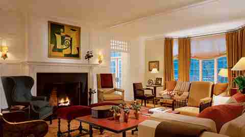
The wife had strong ideas about the interior design, ones that dovetailed perfectly with Hagan's. "I wanted something a little fresher, a modern take on design," the wife says. "I wanted the color to come from the rugs and the artwork. I didn't want a lot of pattern or for the color to come from the sofas and the walls." The couple, who had moved from London, bringing only a few pieces with them, hoped for a mix of disparate furniture, which, as it turns out, is something of a hallmark of the designer's. "We like to open up the world of choices, so that it's not all English and not all French," says Hagan.
That world is beautifully displayed in the living room, where Hagan combined one of the distinctive James wing chairs from her new home furniture collection with, among other pieces, a marvelously quirky trestle low table that's topped by Moroccan leather. The latter piece, along with an exquisite circa 1890 Ushak rug, contributes to the room's warm, apricot tone. Similarly, throughout the house, previously somber rooms assumed subtle color. The master bedroom became crisp white, with a touch of rose; the family room, once a place of almost medieval gloom, turned into a celadon vision, a shade inspired by the room's woodsy view. The solarium, which "did not feel like it had ever seen sun," Hagan says, was suddenly drenched in it. In this way, room by room, a house that had once seemed downright grim moved, inexorably, into the light.