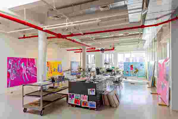
“After a two year renovation, it was apparent to me that we had to have parties, hold salons, share things—the space now seemed meant for entertaining,” says artist Kerri Scharlin of the 7,000-square-foot Greenwich Village loft she shares with her husband, Peter, and two children. The family has been in the 1910 Gold Coast building, originally used for manufacturing, for 22 years. After purchasing one loft, they eventually bought an adjacent one, creating a single vast space that now comprises both their living quarters and Scharlin's artist's studio. “We did minor things while the two kids were growing up," she says. "It was good to have a place that was suitable for magic marker in those years—nothing was too precious.”
When the family was finally ready to really make the space whole and their own, Scharlin started researching similar projects. Her first pass at a concept for the space was a Parisian apartment. Having sat with the idea for a while, she ultimately decided that it did not feel authentic to the building or the space. Then, flipping through the pages of AD, she came across the work of designer Laura Santos, whose own home was featured in the magazine. Enamored with the look of what she did with the space, Scharlin arranged a meeting with Santos and her design partner at the time, Sandra "Sandy" Weingort, and she was sold, realizing immediately how much they cared about small details. (MR Architecture + Decor had already been hired to help with the transformation.)

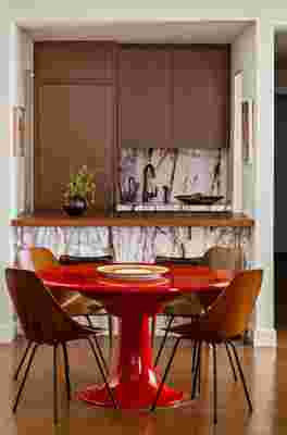
The playroom features a beautiful custom built-in bar with a backsplash made with stone from ABC Stone. The faucet was found at Waterworks, and the cork flooring is from Chelsea Arts Tile + Stone. The red German dining table, from Glen Dooley Antiques, is by Otto Zapf from 1967. The dining chairs are 1950s Italian and were designed by Vittorio Nobili from Versus Gallery. The platter on the table is from MQuan Studio.
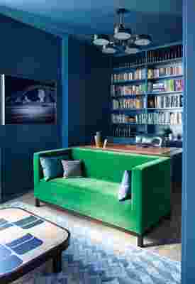
“It was a clear meeting of the minds," Scharlin says, looking back. "Laura and Sandy redesigned the apartment on the spot. I had so many opinions but wanted someone to help distill the vision, and that's what they did.” The designers and their client landed on a feeling of clean and modern with tactile warmth. Kerri also wanted to emphasize visual contrasts, amplifying the tension between old and new. “I really wanted the whole space to feel authentic," she says. “The defining thing was art and books, books, books—so many books that they were central to the design scheme,” recalls Weingort, who, along with Santos, was responsible for editing and curating Scharlin's collection or art, furniture, and, yes, books. "I have somewhat promiscuous taste; they helped edit,“ says the homeowner.
“Books and art make designing a space so much easier because they are usually after-the-fact purchases—the icing on the cake," says Santos. "But to have an incredible collection to begin with makes the space rich and deeply authentic.” The designers let the books and art dictate everything from the decor to the architecture, installing reading nooks and library walls. Any additional furniture was chosen by the designers to complement Scharlin's preexisting collection, again focusing on a mix of old and new. The result is a deeply personal, timeless, and unfussy space. “It now feels very much like it evolved effortlessly over the years," comments Scharlin. "It’s just right, and maybe that's why the apartment is telling me to let people in."


RELATED: An Elegant Aerie Overlooking Central Park Is Revived with a Milanese Sensibility
