
At the age of eight, I was allowed to decorate my own bedroom. My family’s tract home in Indianapolis backed up to a cornfield, and the overall color scheme leaned heavily on blah/beige. I decided to buck the bland and go bold: olive-green walls, chocolate-brown shag carpeting—and a gold disco ball.
In the years that followed, well into adulthood, that sensibility remained. I preferred bold rooms, collections of items, color and more color. My first house in Los Angeles had a prized teal (!) love seat (it was the ’80s; cut me some slack). And my second home, which the lovely and talented Dakota Johnson now inhabits ( AD , April 2020) , was a midcentury masterpiece designed by Carl Maston that I fixed up and filled with period-true swatches of saffron and marigold orange and Tynell chandeliers.

Shadley designed the fountains at the main entrance.
After that house came Diane Keaton’s Spanish Colonial Revival , with its colorful tilework that provided instant cheer. My husband, David Miller, and I moved into that house right before we got married, and we had our two boys, Logan and Ford (now seven and five respectively), there. And with family life came more color (children’s toys are never tasteful beige) and more collections and just . . . more.
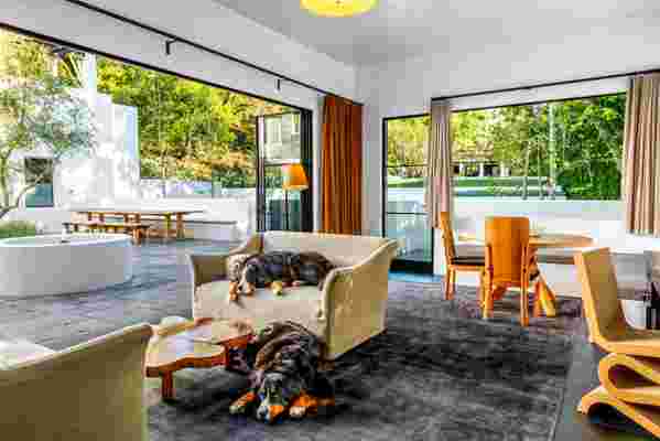
The dogs lounge on an Oliver Gustav sofa in the family room. Joaquim Tenreiro cocktail table; Christopher Farr rug; in the background, Axel Einar Hjorth pine chairs.
My career took off right around the time we had Logan, in 2012, and I went from one or two shows to sometimes 12. Those shows, too, were often colorful and baroque. One day, it suddenly dawned on me that I wanted to live with less: less color, less clutter, fewer things. An edited life.
Out of the blue came a call—do you want to look at a teardown of a house that is big enough for your growing family? “Is it a monastery?” I replied. “Because that’s what I want to live in now.”
“It could be,” said the friend.
David and I went to look at it the next day, and it was a wreck with a fake-turf putting green in the vast backyard. But it did have possibilities, namely high ceilings and oversized rooms. We bought it. And then turned to AD100 designer extraordinaire Stephen Shadley , whose work with Keaton I had admired for years, to help breathe new life into it. (Our house, alongside many others, will appear in Stephen’s first book, due out this fall from Rizzoli.)
The amphitheater-style steps into the front courtyard feature custom riser tiles from Malibu Ceramic Works .
Together, we took it down to the studs and then changed the footprint by adding more rooms, with more negative space. Out of that process came three rules of what I call “minimalist luxury” that Stephen and David and I returned to over and over again:
(1) Repeat, repeat, repeat. What this came to mean is find three materials you love and just keep using them. For the new house, we chose blindingly white chalk plaster walls (popular in old Spanish monasteries!), black and white Malibu tiles done in a modern geometric way, and dark tile and wood floors.
(2) Make it big. From Stephen I learned the great lesson of monumentalism, that grand gestures help focus and declutter a space. Everything in the house was done with this in mind. All of the brick fireplaces, for example, were put up and taken down at least three times to get the regal, walk-in effect we wanted. Huge plaster horse-trough fountains were designed for the front of the house, and they were so large and long we had to take out lap-pool permits from the city. But they are instantly grounding—calming, almost—as they loom large and give architectural order to the façade.
(3) Don’t use color. This was my favorite, and perhaps the most difficult to achieve. All the repeated materials were ordered specifically in muted shades. After years of cleaning up Mattel toys and Legos, I kept saying I wanted to feel like I was living in a bowl of miso soup.
A custom fixture by Stephen Shadley , fabricated by Santa Barbara Lighting Co. , illuminates the black granite kitchen island. Subway ceramics tile throughout.
AD100 interior designer Pam Shamshiri , who worked with us on the interiors, got all this in our first meeting. All of the furniture—the Rick Owens dining table and bench, the Haas Brothers bathtub sculpture, the Vincenzo De Cotiis sofa, the matted silk shaved Tibetan rugs—are big, bold statements, but in calm natural hues.
A sculptural Rogan Gregory light hangs in the formal dinning room/study.
The house now has a weird monastic hush—you enter into an absence of noise and brightness and you feel nourished, forcibly calmed. Grounded. We even applied the rule to the kids’ playroom. A comfy sofa is covered in cotton the color of pewter; a Faye Toogood gaming table is the color of ramen. I thought our boys would rebel, but they actually love it. When we had our first dinner party in this house, six months ago, I casually declared I didn’t want to hang much art because the white plaster walls were the art to me. From around the table came a chorus of agreement: “Don’t touch the walls!” So we haven’t. The exceptions are a mammoth Helen Frankenthaler, a very somber Magritte (the expert eye of Sotheby’s Peter Kloman found both for us), and the occasional oversized sculpture in bronze by the likes of Jean Arp and Lalanne.
Oddly, just as we were in the midst of construction hell in L.A. came a gift from the gods: a house in New York City in the Zen-monastic style I craved. I had begun to shoot several television shows in NYC and had always dreamed of having a place there. The second David and I walked in the door, we knew we were going to buy it. It was exactly the same vibe we were going for in Los Angeles, only . . . done! No fireplaces to redo and obsess over. Everything was warmth and wood and air.
In the library, Pierre Jeanneret chairs surround a 1970s French cocktail table all from Galerie Half .
A hand sculpture by Adam Kurtzman adds a touch of whimsy to the master bath.
With help from AD100 designer David Cafiero , who oversaw the redesign of our Hans Hoffman studio in Provincetown (AD, December 2019) we set out to make it a little more us, a little less wabi-sabi. Our boys are half Swedish, so we wanted to pay homage to that heritage, too, with the furnishings and the delicate pottery. David also immediately understood the notion of bigger and bolder and quieter and designed some of the larger pieces in the house—most notably a spectacular linen master bed—to help ground the spaces. Most magnificent, he came up with a wonderful and quite warm solution to fill the yards of bleached birch shelves that line the library floor: a comprehensive array of arts and sciences books amassed over decades by an acquaintance of his who had recently died in his 90s. The collection of a lifetime was about to be sold off book by book, but he rescued the whole lot and filled the house with them. A Barry X Ball sculpture called Envy stands sentinel, looking down at the street below.
The other thing we love about this house is the art. With help from consultant Joe Sheftel, we specifically sought out pieces from artists taken too soon by the AIDS plague, artists who mean something to us, artists like Hugh Steers and Robert Mapplethorpe and David Wojnarowicz.
Ironically, both houses were completed at exactly the same time. We have loved our year in them, calmed and nourished by their monochromatic subtlety and purposeful restraint. But wouldn’t you know it, I feel an attack of color and Legos and bright Magna-Tiles coming on. We are expecting another baby, a boy, in August.