
Red and blue is mostly reserved for summer cookouts, Fourth of July table spreads, or kitschy beach houses full of sand and white rattan, but that’s all about to change. Blue and red is the newest design power couple, but you don’t have to have an Americana aesthetic to pull it off in your own home. The reason it’s rising to the top of designers’ portfolios and pinners’ decor boards is because of how versatile it is: the pairing has range . You can experiment with sky blue and cherry red for a vintage look, a dark navy and crimson for a Tommy Hilfiger-approved aesthetic, or a peacock blue and burgundy for a bohemian-like vibe. There are so many ways to play with the color, and below are some examples to get you started.
Go all in with the color scheme and try a Palm Beach chic vibe for your living room, like designers David Ecton and Lance Jackson of Parker Kennedy Living did. The pair admitted to Currey and Company that color can sometimes be scary if it’s not used well. But the trick to pulling off a South Florida-like look is to concentrate on texture. Bring out the bamboo, the rattan, the seagrass, and metal. It will give more dimension to the red and blue room.
For a slightly more subdued reiteration, swap out the bright blue for navy. Designer Meredith Heron shared with Style at Home how she transformed her Victorian rowhouse into a modern home, breaking up the strong colors with plenty of white negative space. The trick is to use neutrals like white, grey, and tan as a backdrop so the clashing hues and patterns don’t overwhelm you.
If you feel like a red and blue color pairing feels too “Fourth of July,” try tinkering with the shades. Lynn Chalk used a green-tinged Bondi blue and coral red pairing in this dining nook.
Go midcentury with your blue and red color scheme like In Honor of Design did, choosing a dark blue sofa and contrasting it with a red Persian-style rug. Break up the look with a leather pouf and white faux-shearling throw, and the space begins to look more bohemian and less like a flag.
Illustrator Paula Mills shared her own take on the blue and red trend with The Design Files , where she used the color scheme to add a splash of color to her eclectic living space. It doesn’t feel overly Americana thanks to all the playful, competing shades and textures in the room, and she gave it a luxe twist by adding in velvet couches.
Designer Katie Ridder went all in with the blue color, painting the walls, shelves, and trim in this East Side townhouse a blue-grey hue. She also threaded the color into the furniture and then added a splash of red in the details. You can find a cherry tomato color in the pillows, in the embroidered pattern on the bench, and in the floral buds on the curtains.
For a more rock n’ roll like aesthetic, designer Katie Ridder combined a deep blue and a bright red in this Fairfield County house. Thanks to the red velvet tufted couch and the zebra skin rug, the room feels slightly edgy and extravagant.
For those not afraid of tackling a Tommy Hilfiger-inspired theme, check out designer Brian Patrick Flynn ‘s take on a red, white, and blue bedroom. Inspired by menswear, he painted the walls a steel blue, added a monochrome touch by bringing in a dramatic navy headboard, and then added splashes of red through the lamp shades and comforter. But what makes this room work are the “neutrals” that break up the patriotic colors. They come in the form of white paintings and pillows, green plants, and gold light fixtures and nightstand trims.
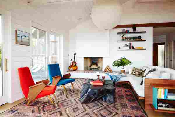
Red and blue look different depending on how they’re used. For example, a plump, tufted blue sofa and red curvy armchair would look more at home in a beach house, but experimental, mid-century inspired chairs like the ones designer Nicole Franzen have a retro vibe.
For those unafraid of color, go the route of designer Katie Ridder , who accented the pastel blue walls of this Park Avenue home with cherry red table lamps, paintings, and a red-trimmed chandelier. This just proves how many different ways you can pair up these two shades.
Red and blue is a playful color scheme for any children’s room, as Color Drunk Studios proves in this shared boy’s room. Instead of feeling patriotic or retro, the color pairing took on a new superhero vibe.
In this quietly vintage living room, In Honor of Design played with different shades of blue across all of her couches, armchairs, and love seats, and juxtaposed the look with a large red area rug.
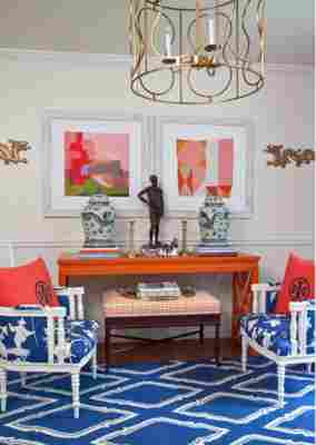
Don’t underestimate the power of mixing chinoiserie with red. Katie Luepke found this vignette at a flea market and painted it a fire engine red to give it new life. But the eye catching look became even bolder when she piled blue and white ginger jars on top.
Make a spacious room feel cozier by piling in the color, like designer Katie Ridder did with this Greenwich Village duplex. She started with varying shades of light blue then gave the lofty living room a retro twist by adding in splashes of red.