
One of the perks of having a mother who was very into both garage sales and interior design was growing up in a house filled with wacky old design books from the 1960s and ’70s. In their pages, I was exposed to many strange and wonderful things, not least among them supergraphics, the crazy stripes and arcs and rainbows that covered every surface of a room, irrespective of walls or floors or furniture. As part of a series about strange old design trends (perhaps unjustly) relegated to the dustbin of history, we’re going to take a closer look at supergraphics—and some of the ways in which they might be coming back.
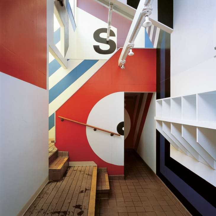
The gloriously large graphics that Barbara Stauffacher Solomon created for the athletic center at Northern California’s Sea Ranch inspired a host of designers to follow in her wake. The bigness and boldness of supergraphics was a neat fit with the exuberance and design excesses of the ’70s—there were even kits that you could buy to help you get the look . (Image from Arch Daily .)
Something about supergraphics always reminds me a little bit of a roller rink. (I don’t have any science to back this up, but I’m guessing that supergraphics, with their vibrant color, sense of movement, and unabashed cheerfulness, were a popular design element for skating rinks.) The crazy thing is that if you imagine this room without the rainbow stripes, it’s really quite a minimalist space, almost remarkably restrained. With them, it’s a wild, brazenly colorful love den. If you want to get the look, you can find something remarkably similar on Paddywhack KnickKnack . What a time to be alive.
The young woman in this room from Cultura Colectiva looks sufficiently transported by the waves of color radiating all over the walls and ceiling. (The furniture, mercifully, is left in neutral tones.)
The execution of this stripe, which crosses walls, window trim, blinds, carpeting, and even a bedspread, represents true dedication. Even if you don’t love the look, you have to admire the chutzpah, and the sheer effort, that went into creating this. Image from AnOther .
These supergraphics, spotted on AnOther , make me think of a very fancy wrapping paper, or perhaps a glamorous TV tray. While I would not decorate my house with this look, I would be very interested in going to a bar or restaurant with this particular aesthetic.
I did say that supergraphics had been ‘relegated to the dustbin of history’, but I lied. Sort of. The colors are a bit softer, and the graphics a bit looser, but the wall treatment in this image, from Dulux via The Design Chaser , is clearly recognizable as a modern version of supergraphics. The graphic is still definitely the main statement in the room, but the more muted colors mean it’s less overwhelming, and plays more nicely with the other elements in the space.
Here’s another interior from Dulux via The Design Chaser . The candy colors and arched elements give it a playful, almost childlike feel, but the very modern furniture and dark floor help to ground the space.
One of my favorite supergraphics, and really one of my favorite wall treatments of any kind, is this cheerful rainbow painted onto the wall of a tiny patio in Dan and Shannon’s DC home . It’s the perfect proof that old trends can take on new life, and that a little color (and a little thinking outside the box) can transform any space.