
Gray interiors are consistently reader favorites, and what's not to love? The elegant hue manages to be both a striking choice and a goes-with-anything neutral at the same time. Plus, painting the walls a moody gray instantly elevates even the most functional spaces. The color looks just as good in a kitchen or bath as it does in a bedroom or living room—the possibilities are endless. But because of that, choosing exactly the right shade can be a challenge.
Like white paints, grays have a variety of undertones that impact how the color appears in a space. There are cooler shades with blue or green undertones, as well as warm hues with hints of orange, red, or brown. These undertones can make a hue look dramatically different, depending on the light and location of the room. That’s why it’s so important to test out paint by applying a sample swatch in the space and looking at it throughout the day as the light changes.
One of the beauties of the color gray is its range of tones. Soft, pale grays are great if you want a neutral shade with more depth than white, while darker shades can add impact and create a bit of drama in a space. Grays are also good at playing well with others. For designer Cortney Bishop , Farrow & Ball’s Down Pipe is a go-to shade for its ability to complement other colors. “The value of this color is super rich and bold—more so than any other gray I’ve used. It has a great foundational quality to it. I like to pair it with black, creamy whites, metals, and rich woods like walnut. It works just as well with neutrals as it does with jewel tones.” We've rounded up the best-selling gray paint colors right now to make the process of finding the perfect shade a little easier.
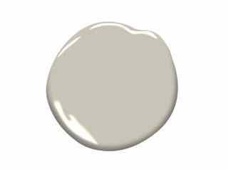
Revere Pewter (HC-172) is one of Benjamin Moore's best-selling shades . This light gray has warm undertones and works well in open floor plans and transitional spaces.

Benjamin Moore's Wrought Iron (2124-10) is a dark gray that's practically black. Use it with white trim for a traditional but dramatic space.

Farrow & Ball's Downpipe, a dark lead gray with blue undertones, is a designer favorite . The shade is great for creating dramatic hallways or intimate small spaces.
Sherwin-Williams 's popular Agreeable Gray (SW 7029) is a warm neutral that works as well on exteriors as it does indoors.
Functional Gray (SW 7024) by Sherwin-Williams is a medium hue that can add coziness to living or dining rooms and works well with both natural and artificial light sources.
Manchester (29-27) by Pratt & Lambert is the perfect cool gray with blue-green undertones. The color is a chic choice for living rooms and bedrooms.
Gravity (4005-1B) was one of Valspar 's colors of the year in 2016. The cool blue-gray paint works well paired with white or blues such as navy.
Valspar's Soulful Grey (6004-1B) is a deeper shade that looks beautiful with warm whites, such as the company's popular Du Jour hue.
Swirling Smoke (OL196) by Olympic is a pale gray with orange undertones that can help warm up a space lacking natural light.
If you're looking for a darker shade to complement soft neutrals or black, Olympic's Dover Gray (OL168) may be the perfect paint for your project. Related: AD ’s Guide to Decorating with Color